Every day all around us we see hundreds and thousands of iconic business logos. Be it the local dollar store or of an online eCommerce giant, logos are a crucial visual element of all of our lives. But more often than not, we do not think about the meaning behind a particular company logo. We often fail to realize the fact that a simple logo is created after a lot of thought has been invested in it.
The meaning behind a particular business logo is not only significant, but it also reflects the philosophy of the company its representing and its brand values. Thus, it can be conveniently said that a logo design says a thousand words about a business and that is the reason why companies spend so much money, time and effort in creating it.
Whether you are a business owner or a customer, the best you can do is appreciate the hard work that has gone behind all these world famous logos we see every day and learn a thing or two about the company it represents and the branding they’ve done over time.
Table of Contents
25 World Famous Logos & Hidden Meanings Behind These Iconic Brands
Business Owners all across the world, especially small business owners, keep trying to find ways to create a relationship with their customers to grow their business further. Many smart ones realize early on, that the very first step to achieve business growth could be to have a distinguished small business logo. Inspired by the same, we’ve compiled this glossary of the world’s most famous logos with the hidden brand stories behind them in an effort to provide you inspiration to design logo for your own small business. You can learn about these company brands while discovering the hidden meanings and messages in these famous logos. Let’s get started.
Amazon
Everyday more than 5 million people all across the globe use Amazon to search and shop for thousands of products. Amazon, the platform whose logo tops the list of world famous logos, is undoubtedly the largest eCommerce platform on Earth and sells everything from books to movies and fabrics to curtains. The eCommerce portal which is home to more than 12 million products is often the first choice for everyone who wants to shop online.

The company which was first started in the year 2000 by founder Jeff Bezos has come a long way, but the main motto of the company, which has been to put a smile on the face of every customer has not changed. If you take a close look at the Amazon logo, the first thing you will notice is the arrow which starts from the letter A and goes all the way to the letter Z. At first glance this looks like a smile, thus representing Amazon’s earlier stated motto.
But if you look closely, the arrowhead has a hidden meaning behind it and that is
representation of the fact that Amazon sells everything from A to Z which is a direct correlation of 25 million products that it houses in its inventory and sells to customers all around the globe.
Nike
If you are a sneaker head like me, you are definitely a fan of Nike. One of the most iconic brands of the 21st century, Nike is known for its stunning shoes and sports gear. A global brand with more than 45,000 employees globally, the Nike Swoosh is one logo that you cannot miss. The Swoosh is a rather simple and elegant logo at first glance, the symbolic of it is far beyond what meets the eye.

The Swoosh was inspired from the Greek goddess of Victory, Nike. The Swoosh whose literal translation is the sound one hears who something zips past them in high speed was chosen to represent the core ideals of Nike as a brand and the products they make. The logo is shaped in the form of an arrow that represents speed and energy and the logo is made of three solid lines which together represent solidarity, unity and power. The Swoosh is one of the most iconic logos in modern history and has been designed to awe observers every time one takes a close look at it.
Domino’s Pizza
Every one of us likes pizza. Irrespective of our age and diet plans when we see a pizza box in front of us, we can hardly contain our excitement and before we know it that box lies empty in our hands; and what is better than the good old Domino’s pizza. They are fast, affordable and most importantly easily available all around us.
We have seen the Domino’s logo thousands of times pasted on top of their delivery boxes, banners, ads, etc. and the predominant assumption is that this world famous logo is based on the infamous indoor game of the same name. However, if you take a moment and look closely, you will observe that there are 3 dots on the red square.

When the first Dominos opened its doors, the founders who came up with this brilliant small business idea planned to add a dot every time a new franchise opened, but soon enough they realized that it was a bad plan, considering the wide expansion the company undertook.
Today there are more than 25,000 dominos franchises all around the globe and we can just imagine how the logo will look if the founders stuck with the original plan.
Starbucks
For all us coffee lovers and addicts out there, Starbucks is the place to go and visit. Starbucks a brand that dates back to 1971, is known for its rich heritage and exotic coffee flavors all across the world. The brand was started with the intention of procuring and selling the best coffee available in the market, but over the years the brand has evolved significantly over the years and today Starbucks is much more than the best coffee in town.
If you take a close look at the eternal logo of Starbucks coffee, you will see that it has the image of a mermaid with a round embroidery of the brand name around it. Known as the Starbucks Siren, the mermaid was originally shown naked, but over the years the founders changed its representation to the current version where only the mermaid’s face can be seen. This was done in order to make the logo modest and also pay homage to the roots of the brand which can be found in the shores of Seattle.
Apple
One of the most iconic brands of modern times, Apple Inc has a fairly simple logo. Founder Steve Jobs originally wanted a logo with Sir Issacs Newton’s image for representing the company but in later years he decided to change the logo and finalized on the fruit. But even so, since the time this iconic logo has existed there have been several theories surrounding it all of which claim to explain why Jobs selected a fruit for representing a computer company.
Among these one of the most famous theories states that the logo is symbolic of knowledge that is derived from the biblical Garden of Eden. However, the explanation behind the logo is fault simple. Jobs in an interview stated that he liked the sound of the name Apple and thus choose it as the company name. As for the logo, the bite is only there to instill a sense of scale so that observers do not confuse it with being a cherry. Thus, both the company and its logo have fairly simple meanings; they sound and look nice.
Not a day goes by when we are not making use of Google to find the information we need. Chances are that you stumbled on this article, because you searched for a relevant keyword on Google, but even after regular use have you ever thought about the world famous logo of Google and the story behind it.
On the surface level, there is nothing much on the Google logo. The name of the company is spelled out using the 3 primary colors, but the green L throws that right out the window. In an interview, when the founder of Google, Larry Page was asked about this, he stated that the company started using the four-color scheme in its logo as it wanted to differentiate itself from the rest.
Color psychology plays a great role in logo design; and similarly, the use of four colors indicates that google is not merely a brand that does everything that is expected of it, but rather it is an inventor and innovator that is constantly expanding and exploring new horizons.
Since the first use of this new color scheme, the company has made it a point to use it across all their products and services and this can be evidently seen in everything they design and invent; be it the Chrome Browser or the Pixel Smartphone series.
McDonald’s
Almost all of us have visited a McDonalds at least once, but most of us feel that the alphabet ‘M’ on the iconic McDonalds logo is symbolic to the M in the brands name. However, if you have seen the 2019 release called “The Founder”, you know otherwise. The golden arches as they are called are symbolic of the architectural design that was first proposed for the McDonalds franchise.

DC Comics
There is a child in all of us and whether or not we have the time to embrace and accept its presence there are moments when all of us become children. One such brand that reveals the child is DC Comics. The famous brand behind all our favorite superheroes indeed knows how to design a logo that reflects with its brand identity and message.
When the company was first started the founders decided on a simple logo which spelled DC Comics. But over the years as the audience and fan following of DC’s creations increased, the company decided to revamp its logo.
The DC company which now produces a lot more than just comics and comic book characters has an intriguing logo which shows the alphabet ‘D’ to be slightly peeled in the front to reveal the alphabet ‘C’. The message here is that DC hasn’t forgotten its humble beginnings and till date the company strives to bring out the child in all of us.
Adidas
Irrespective of the fact that you are an athlete or not, every one of us has heard of the name Adidas at least once. And for those of us who are fans of sneakers, chances are high that we own at least one pair from Adidas. The company first started in the year 1949 in Germany is now synonymous with high-quality sneakers and shoes made for the athlete in all of us, both indoors and outdoors. When the company was first started, the founders wanted an inspiring logo that would look good on their shoes.
But slowly as the years progressed and their audience matured and started associating the brand with sports gear, Adidas realized that they need a refresh of their brand identity. Thus, in the year 1990, Peter Moore, one of the most famous logo designers of the time was hired to create a new logo for the brand. Shortly after, the refreshing and sporty logo with three diagonal stripes we all associate with Adidas was created.
At first glance, it is hard to understand the deep meaning behind the three diagonal stripes, but if you observe closely you will come to realize that the stripes are a representation of the hardships athletes need to endure on a day to day basis. The brand thus synchronizes its message with the struggle of athletes worldwide and embraces the fact that becoming an athlete is in no way an easy task.
Walt Disney
Walt Disney, a company we all know and love, is at the center of every children’s
dream. From Cinderella to Aladdin to Frozen, there would be hardly anyone whose childhood hasn’t been influenced by this brand. A company founded on the principles of kindling and recreating the fantasy of every child across the world is today known all across for its stunning motion pictures and theme parks as well.
Similar to the principles of the company, the dreamy logo is also quite alluring. Initially, it was believed that the famous logo was inspired by the signature of the Founder, Walt Disney. But the truth is the emblem was hand-drawn by one of the company’s employees back in the day. The name of the company in the logo shares a backdrop with the iconic Cinderella’s castle, but depending on the creation, the castle is sometimes changed to suit the taste of the audience.
IBM
International Business Machine (IBM) is a brand that forever changed the way we use
computers with its range of products. Since its inception, the company has been constantly engaged in its endeavor of inventing and producing technologies that change our lifestyle for the better and this philosophy can be evidently seen in the company’s logo as well. The company’s geeky logo spells out its name in the Serif Font with breaks in between.
The original design of this technology giant’s logo did not have any negative space, but it evolved with time as earlier printers were unable to print the whole text at once. Along with this, the use of blue ink was more in the earlier version of the logo, thus leading to wastage of ink and ink spilling.
Thus, the company decided to include negative spaces and tinker with the end of the alphabet ‘M’ a little. If you look closely, you will realize that the end of ‘M ‘is made to look like an equal sign which represents the company’s philosophy of equality for all.
BMW
Everyone around the globe has heard of the iconic automobile company BMW and its innate creations that are revered all around the globe. BMW is a German Automobile Company and is one of the pioneers in developing the best vehicles of the modern world. One of the striking aspects of this brand that all of us have thought about at least once is the brand’s iconic logo. The alternating shades of blue-white give the brand a luxury outlook that is hard to ignore. But similar to the Apple logo, the theory behind BMW’s world famous logo is also fairly simple.

Back in the day, BMW as a company was into manufacturing airplane engines as well and thus followers of the brand came to the conclusion that the alternating shades of blue and white were meant to represent the color of sky and BMW’s airplane engines soaring above it all. On the contrary, the logo has quite a simple explanation; the founder of the company Karl Rapp wanted the colors of Bavarian Free State in their logo, but doing so was illegal. So, they simply reversed the colors and the iconic brand logo came into existence.
Chupa Chups
Chupa Chups is the most favorite brand of lollipops in the West as of today. Known for its delicious taste and flavor, the brand is a favorite among teenagers and adults alike. Like the brand, its logo is iconic across several dimensions as well and not many people know this, but the great artist Salvador Dali was the man behind it.
Dali an artist known around the world for his iconic creations was a man who held no interest in paid assignments, but the case with Chupa Chups was slightly different. The founder of Chupa Chups was a dear friend of Dali and when he presented the opportunity to Dali, he had to come out with the best he had.
Although the calligraphy behind the brand name was pre-decided, the iconic flower shape on which the logo resides was a purely Dali concept. Along with this, it is rumored that Dali was the one who suggested that this famous logo be put on top of the brand’s products and not on the side so that everyone could notice it at all times.
Cisco
In the modern world where each of us is connected at all times, Cisco is a company that we can’t ignore. The telecommunications company which was found in the year 1984 in the heart of the Silicon Valley is known for its creations that have altered the way we communicate and keep in touch with each other. Moreover the telecommunications brand has an equally iconic logo that leaves a lasting first impression.
The waves on top of the brand is a graphic representation of the iconic San Francisco bridge and in an interview the founders revealed that this is their way of paying homage to their birthplace.
Along with this, one more striking aspect of the logo is the fact that the name of the brand is not capitalized as this too was derived from the name “San Francisco”. Thus, if there is one brand out there who knows how to pay homage and never forget its roots, that’s cisco.
FedEx
Similar to Cisco, another brand that has forever changed how we lead our everyday life is FedEx. The American logistics company has a fairly simple logo at first glance, but if you look closer you will realize that there lies an arrow between the E and X. This arrow according to the company website, symbolizes the fact that the company is always on the move. Along with this, another interesting aspect of the FedEx logo is its color scheme.
While the purple of the Fed remains standard, the color of Ex keeps changing depending on the particular purpose it is being used for. Grey is for corporate, orange for express, green for ground, yellow for trade and blue for critical. Thus, one thing that can be easily understood is the fact that FedEx as a company is truly virtuous when it comes to adapting its ingenious logo according to customer demands.
Pepsi
A brand that dates back to the world war 2 and beyond, Pepsi is one of the most easily recognizable global beverage brands of modern times that holds top spot among the world famous logos. The current logo in its earliest iteration was chosen in the outbreak of world war 2. The three-color scheme of red, white and blue was chosen for the representation of the logo on the bottle cap as a way of enticing support and solidarity to troops who are stationed abroad. The logo came to be known as the Pepsi globe and from then the same version of the globe has been carried forward.

Today Pepsi uses various iterations of the same logo depending on the product they are selling. For example, on a diet Pepsi the white region is made to look like a half smile while on the regular Pepsi, the white region is made to look like a full smile. Thus, the next time you take a look at the Pepsi logo, just know that the creators behind the brand are always smiling at you.
Wendy’s
If you are fan of good old burgers, then you surely are a fan of the best in town Wendy’s burgers. Wendy as a brand has been around for ages and the brand’s iconic logo reflects the same. When the first Wendy’s store was opened the logo was designed after taking inspiration from the founder, Dave Thomas’s daughter, Melinda-Lou “Wendy” Thomas. For several years the company stuck to the same logo, until recently when the company decided to give this famous logo a makeover. The iconic red pony tailed girl was made to look more mature and a little less childish in the current logo, so that it is in sync with the age of its inspiration, Melinda.

However, there is a famous controversy surrounding the Wendy’s logo. Some are of the opinion that there is a hidden message in the collar of the logo that reads “Mom” and is a significance to the mom-style burgers that Wendy’s make till today. However, the company website disregards this claim and thus it is up to you to decide.
Toblerone
The Swiss chocolate Toblerone is loved all across the world for its rich taste and heritage by adults as well as children. The company which has been around for the past 108 years is one brand that knows well how to pay homage to their roots. If you take a close look at the brand look, one of the first things that become evident is shape of the Matterhorn peak.
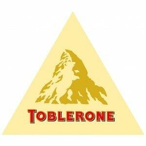
But there is more to this creative logo than just the peak. Notice the white space in between the mountain and a keen eye will notice the shape of a bear there. Once you see it, it is hard to ignore and becomes prominent on the surface instantly. Now you might ask, why the shape of the bear.
The shape of a bear was chosen because it is the symbolic representation of the city of origin for Toblerone which is Berne. Even the name of the brand is coined in a way to represent the name Berne. As for the shape of the chocolate, that is just a happy coincidence and it was actually inspired by the shape of a human pyramid and not the Matterhorn peak as some might believe.
Gerber
If you have a child at home, chances are high that you have heard or used one of the many products manufactured and sold by Gerber. The iconic baby product company which has been around for ages now first began as the Fremont Canning Company until one day the founder of the company Mr. Daniel Frank Gerber stumbled across the idea of selling canned strained vegetables as baby food.
An invitation was published by the company for an appropriate logo design and the winner was Ms. Dorothy Hope Smith who had sent in a hand-drawn sketch of her neighbor’s baby. Daniel and the board liked the sketch so much that they decided on the same for the mesmerizing logo and even changed the company name to Gerber to match the brand’s image and promise; and as they say, the rest is history.
NBC
The National Broadcasting Company (NBC) is known to all of us around the world. Although the company is American by birth, the company has a truly global scale and this message is prominent in its famous logo. The current logo of the company which has a colorful peacock was made with the intention of selling more color television sets at the time when the brand was owned by the RCA network. In 1956, when color TVs were just released in the market, RCA wanted a colorful logo whose entire beauty could only be realized on color screens and thus this logo was revealed on the 60th anniversary of the company.

The NBC logo has two important features that need to be noted:
a. First is the six colorful feathers of the peacock, each of which is representative of the brand’s different businesses and divisions.
b. Second is the peacock’s head which is turned on the right, looking towards the future thus indicating that NBC is a future-forward brand and is always innovating itself to meet the needs and demands of today and tomorrow.
Paramount Pictures
The most memorable movies of this century have been produced by Paramount Pictures. The mountain valley company which was founded by Adolph Zukora in the year 1912 is responsible for most of the movies we all love and adore today. Among the many titles that have been produced by the company, some of the most successful ones include Titanic, Transformers and Shrek. It is rumored that Adolph was the creator of the exquisite logo and the mountain in the logo is a representation of the Ben Lomond Mountain in California.
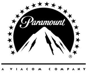
Originally the mountain was adorned with 24 stars that represented the 24 actors who were originally hired by the company. Thus, each star quite literally represented each actor. However, over the years, the number of starts was reduced to 22 for aesthetic purposes and the company website says that the stars are no longer representative of actual movie actors but now act as a crown jewel to the mountain range and the logo.
The modern equivalent of the age-old tradition of pinning items we like and love on to a board has been established by Pinterest. A company known across the globe for being the host to some of the best media and creatives that can be found online, Pinterest has a very interesting message hidden behind it. If you break down the terms of the company, it becomes Pin and Insert which when combined becomes Pinterest.

Since pinning is such a vital concept of the brand’s identity, the founders decided to design a hidden pin in the P of the logo. If you look closely, the P in the brand name is shaped in the form of an actual pin and this creative is used all across the brand’s digital assets. Thus, the hidden message behind the famous Pinterest logo is all about emphasizing the brand’s working principle over and over again.
Toyota
One of the most famous car manufacturers of the modern century, Toyota is known all across for its consumer friendly and affordable cars. If you take a look at the logo of Toyota, the first thing that becomes instantly evident is the T shaped across the logo. The company website reveals that the eccentric circles that have been used to construct this automobile gian’ts logo is a representation of the entwinement of the company’s heart with that of their customers. But there is even more to the Toyota logo than meets the eye.
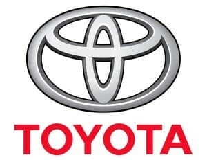
If you dissect and arrange all the elements that have been used to construct the logo, you will find that all the letters are clearly spelled out in the logo, right from the T to the A. Thus, it can be rightly said that the Toyota logo is one of a kind and distinctive in its own unique ways.
Mitsubishi
A company established in the year 1870 in imperial Japan, Mitsubishi is one of the only companies of modern times that is known for their superior quality of products as well as rich heritage. The company was founded when the Tosa clan acquired the Tsukumo Shokai shipping company from the Iwasaki family.

After the foundation of the company, the two families decided that the logo should represent and pay homage to both the families and thus a shape comprising of three diamonds was crafted. The diamonds are a representation of the rich heritage of both the Tosa as well as the Iwasaki family and since its creation, the logo has been used as the corporate representation of the brand all around the globe.
Vaio
The famous brand from Sony is a long-lost legend in modern times, but yet this logo is one that deserves a mention in every list. When Sony envisioned Vaio, they wanted to create a brand that pays homage to the past as well as aims for the future. A brand primarily focused on the manufacturing of computers and electronics, the brand has a logo design that combines the aesthetics of both analog and digital signals in a unique and aesthetic manner.

The first part of the logo that is “V and A” are represented in analog signal, whereas the later parts that is “I and O” are represented with the help of 1 and 0 which are digital signals. Thus, the Vaio logo is one that is connected to its origins as well as envisions the future.
Conclusion – World Famous Logos
Every logo design we see around us has some meaning or brand story attached to it. Thus, the next time you see a logo you really like, stop for a moment and think what it can mean, because as with all forms of art, logos too deserve to be appreciated over and over again.
Another great thing to learn here is that if you’re a business owner(small or big business alike), investing in a good design that portrays your brand’s values will boost your marketing efforts at all times.
We hope this list of the world famous logos mentioned above and their hidden brand stories were of a great inspiration to you for pursuing your own business logo design. We’d love to hear your views in the comments section.
Is Your Brand Story Ready? Need A Fabulous Logo Design With A Hidden Meaning For Your Small Business?
Get an iconic custom logo design for your business tailored perfectly to your preferences. Head over to our Logo Contest comparison section that makes it super easy for you to choose the right solution to source an eye-catching business logo.


One Comment
One of the best and illustrative blogs I read about the logos famous in the world today. Had no clue about the story behind McDonald’s golden arches myself, even when I eat there like every other day. Good stuff!